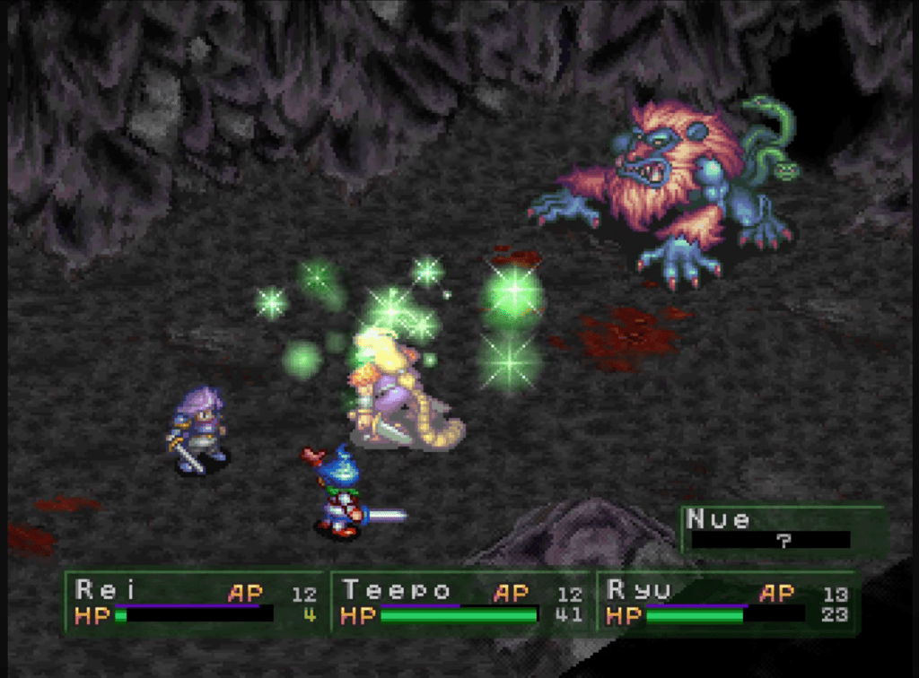
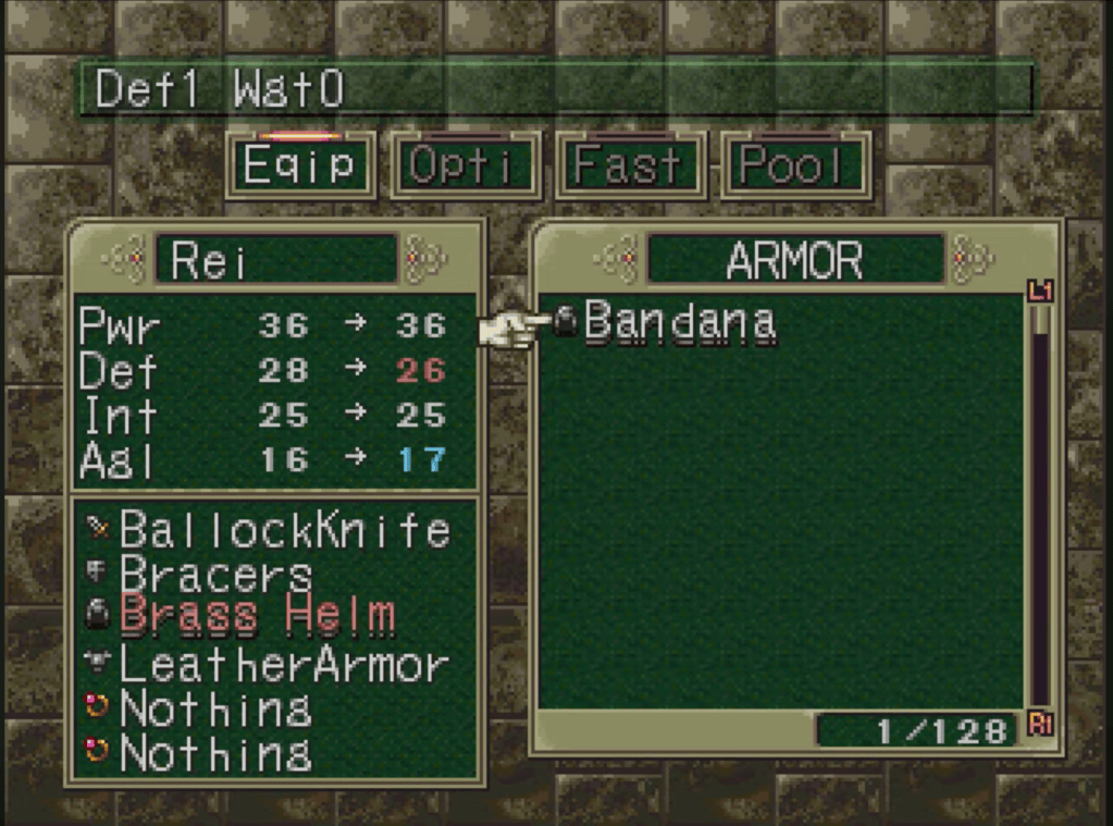
Ever wonder how classic video games communicate health and survival at a glance? My analysis of the retro PlayStation 1 classic Breath of Fire III connects directly to good health and well-being by looking at how visual design signals physical status, damage, and recovery. The game uses clever color psychology: red instantly warns you of damage, danger, and lowered stats, while green visually represents vitality and restoration matching the iconic green healing herbs you use to restore a character’s health.
I picked Breath of Fire III because it’s my all-time favorite game and it holds a special place in my heart. As a kid, my absolute passion to follow its intriguing storyline, cast spells, and unleash dragon transformations actually motivated me to learn how to read. Exploring this childhood favorite allowed me to examine its charming 2D pixel art and 3D camera angles through a fresh, creative lens.
To put this project together I captured screen shots to analyze elements side by side, applied design principles to consider its color cues and menu readability, and pulled it all together using word processing software.
Ultimately, this project showed me that video games are far more than just fun, they are complex digital art. I learned how intuitive visual cues, like red for harm and green for health, make a virtual well-being crystal clear, proving that visual clarity and smart color choices make any interactive experience truly shine.
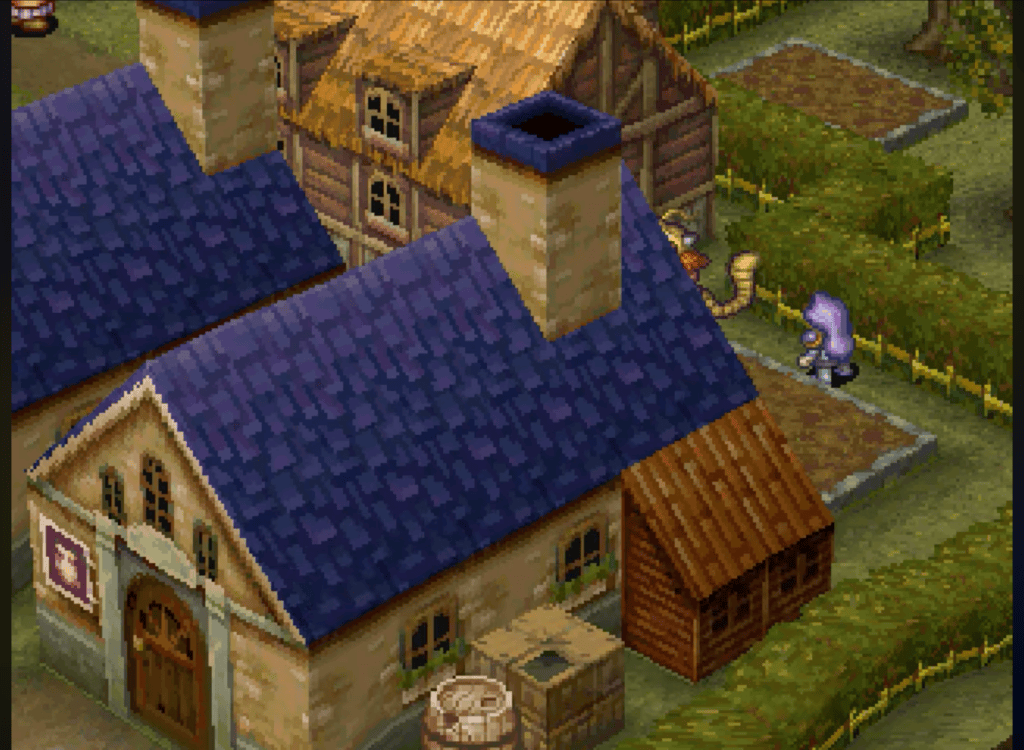
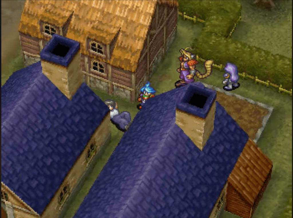
What is my digital media artifact? Breath Of Fire 3 is a PS1 JRPG (Japanese Role-Playing Game) from the company CAPCOM. This was the first Breath Of Fire game to be made for the PS1. It is a classic fantasy Japanese role-playing game with story driven gameplay. It blends 3D environments and camera angles with detailed, hand drawn 2D character sprites. You progress in the game by talking to your companions and certain NPCs (non-player characters or non-playable characters), fighting enemies using a turn-based system, and leveling up by gaining XP (experience points). All these aspects lead the player to through each section of the story. This retro video game has a somewhat simple design using animated 2D pixel art for its main characters, enemies, and interactive objects. The world map, towns, and dungeons are built using polygonal 3D environments. This combination of 2D animation, pixel art, and 3D environments give the game a unique look and feel. The camera is locked into place until you use the 3D camera feature that allows you to look around corners and behind objects to find hidden items, treasures, and content. Pictured below is an example of the 3D camera being used. The first image is the stationary camera; the second image shows the 3D camera being used and reveling a hidden person that you can talk to. The camera does have limitations on how far it can be angled up, and to the left and right, but it works well within the game. The houses in these images and throughout the game were hand crafted using digital pixel art grids and tile sets. Most of the houses in the game have matching colors grouped together like the two blue houses here. The log cabin style house in the background points in the direction of other buildings with the same style.
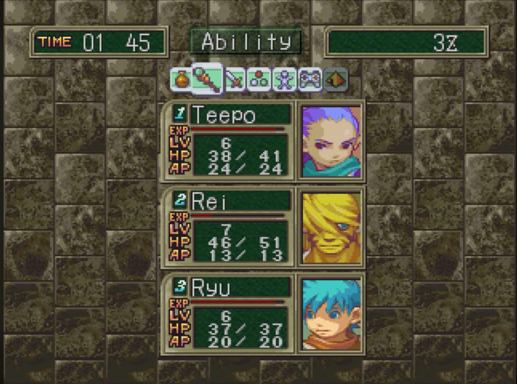
The images below are two sections of the main menu screen. The first screenshot is the main menu that the player will navigate to use an item, change equipment, or look at the abilities of the characters. The arrangement of this menu is simple to understand; at the top there are symbols for each section of the menu screen and above these symbols is white text that clearly shows the user each category. The text has a transparent green background which helps to make it easy to read, and the font choice matches the style of the gaming era. Below the symbols are the different characters in your party that you can choose from, and the characters are arranged from the player’s current battle formation. All the important content is nicely formatted in the center of the main menu making it intuitive to navigate. The second screenshot is inside the equipment section of the menu. Changing equipment can be overly complicated in strategy games but this game makes it easy to understand. Looking at the cursor, we can see it currently on a helmet named “Bandana,” throughout this game red is used to convey danger, damage or something negative. Here we can see that the Bandana has a lower defense than the Brass Helm that is currently equipped, however the agility is higher with the Bandana which is highlighted using a light blue color. Even when I played this as a small child, I understood the equipment system in this game, it’s that intuitive.
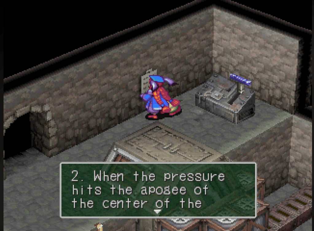
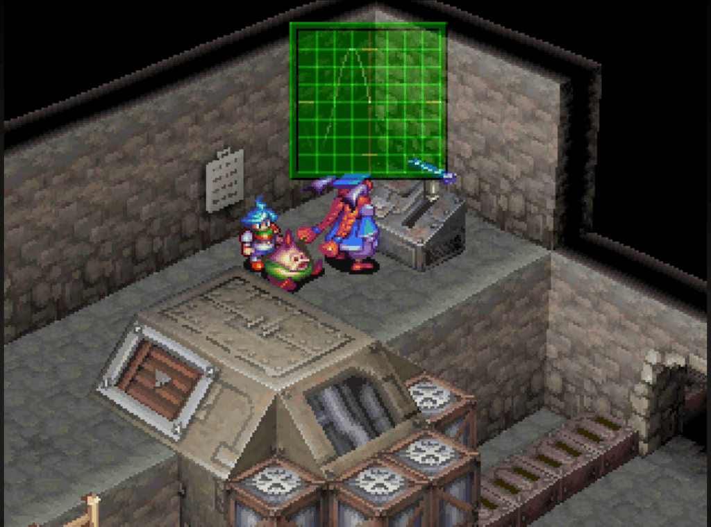
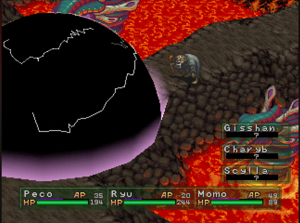
Looking at game’s interactivity aspects, I wanted to point something out I didn’t like to be completely fair in my evaluation. The screenshots below display two minor critiques I have with the game, the first is a section of the game where you must activate a boiler. To do this you must pull the blue lever when a bouncing line (second picture) hits one of the lines on the green graph. This is explained briefly in the below in the first screenshot, but the text is not entirely clear about that. The bouncing line is a lighter green color and blends into the graph making it difficult to see. These two issues combined make it hard to complete this section of the game. My second complaint can also be seen in both the images below, this section of the game has a black void instead of the enclosed walls, it looks a bit strange and out of place since most of the game does not have this problem. It gives the game an unfinished look especially seeing the inside of the walls and is a bit distracting from the other better-looking graphics.
What I think would improve the game are just a few simple suggestions. Make sure the text is clear and concise when giving instruction on a game mechanic. Being aware of color choices and making sure they don’t blend when you need to have contrast between them. Do not deviate from the artifact’s overall design and style so that the game feels consistent and balanced. Ultimately, I love the game, in fact it’s my all-time favorite game and has been since I was a kid and it motivated me to learn to read. It has a user-friendly interface, awesome character designs, cohesive environment layouts, and a compelling storyline that keeps you engaged. The animations for the healing spells and attacks are visually captivating; I look forward to seeing them each time I turn into a dragon, use and item, or cast a spell. I love everything about Breath Of Fire III, from its charming 2D pixel sprites to the 3D environments, it has something special. Not to mention you can not only turn into a dragon, but you can turn into different breeds of dragons depending on the combination of gene splicing you do. I could talk about every aspect of this game, but you don’t have time to read a whole book. If you have time and game a little, then I highly recommend playing Breath Of Fire III. As a bonus I attached a screenshot of the dragon transformation below.
Cited Works
Screenshots taken from:
Principles of design:

